By DOM Structure
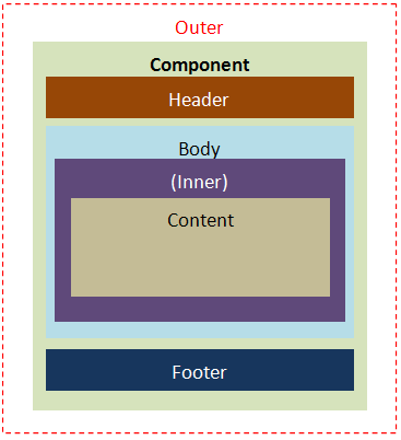
The naming pattern of the DOM structure is used to describe components which are composed of more than one part. The following recommended naming patterns are to clarify the DOM structure of ZK components, not a limitation.
Layout Elements
The following naming patterns are based on component layout. For example, "z-window-header" means header part of window component.
Orient and Position Elements
The following naming patterns are based on component orientation and positions. For example, "z-menubar-horizontal" means the menubar component is in horizontal orientation.
- -vertical:
- vertical aspect, like menubar.
- -horizontal:
- horizontal aspect, like menubar.
- -start:
- beginning aspect, like toolbar.
- -center:
- center aspect, like toolbar.
- -end:
- ending aspect, like toolbar.
Other Elements
The following naming patterns are based on component look and feel and some interaction. For example, "z-combobox-button" is the drop-down button of combobox component.
- -faker:
- faker element to mark a reference point at browser side, like grid, listbox, and tree.
- -text:
- text area.
- -input:
- input element.
- -separator:
- separator element.
- -image:
- image area specified by comoponent's API.
- -icon
- for component interaction
- -popup:
- pop-up element, like datebox, combobox, and so on.
- -button:
- a button.
Tool Icons
The following naming patterns are based on component interactions. For example, "z-panel-close" is a closed icon of panel component.
| Switch | Resize | Split |
|---|---|---|
|
|
|
Version History
| Version | Date | Content |
|---|---|---|
